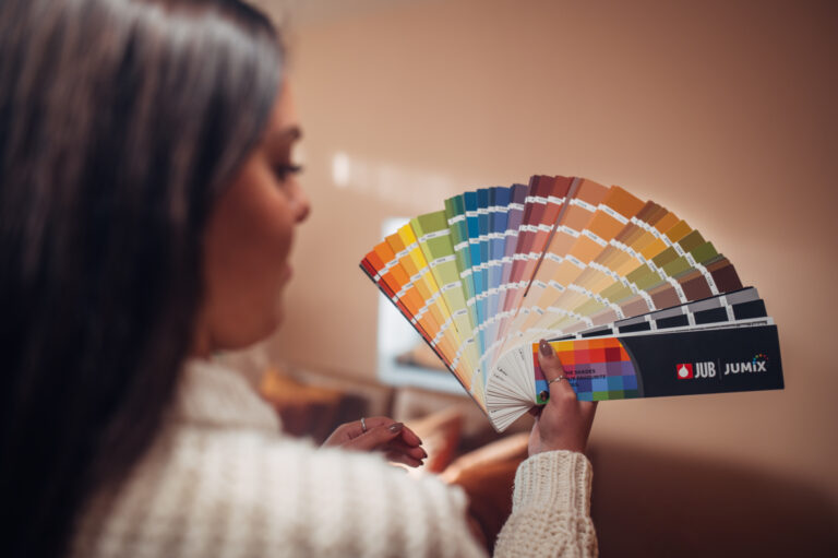
White is not just one shade. Its undertones can bring a pleasant sense of warmth and homeliness to a space, or unintentionally make it feel cold and sterile. While we often assume that choosing white is a foolproof option, the reality is somewhat different. Below, we reveal three common mistakes people make when choosing a shade of white and explain how to ensure your home reflects exactly the atmosphere you want to create.
Choosing a shade in the store
One of the most common mistakes is choosing a shade simply by looking at a colour chart in the store. A small printed colour sample under fluorescent lighting will never reflect the same colour as the one we perceive in our own space. Before making a purchase, it is therefore a good idea to get a few colour samples (you can order them through the JUB online shop) so you can test the colours in your own home. You may find that a particular shade suddenly looks too subtle, too warm or too dark.
Not considering the combination with other materials
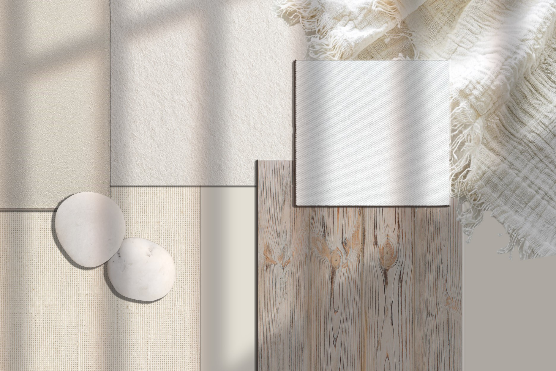
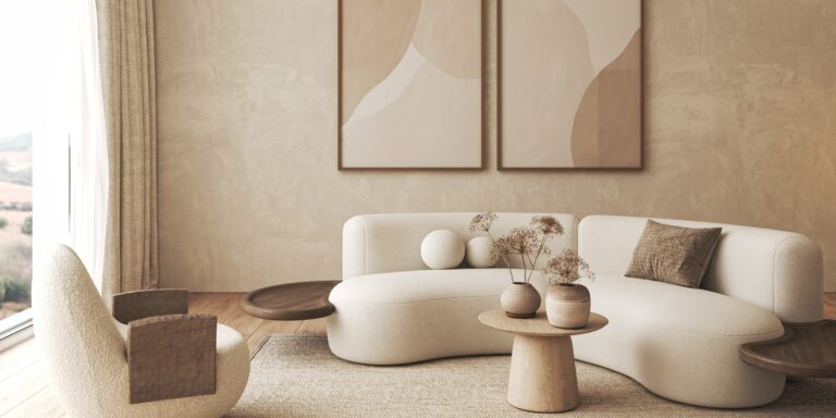
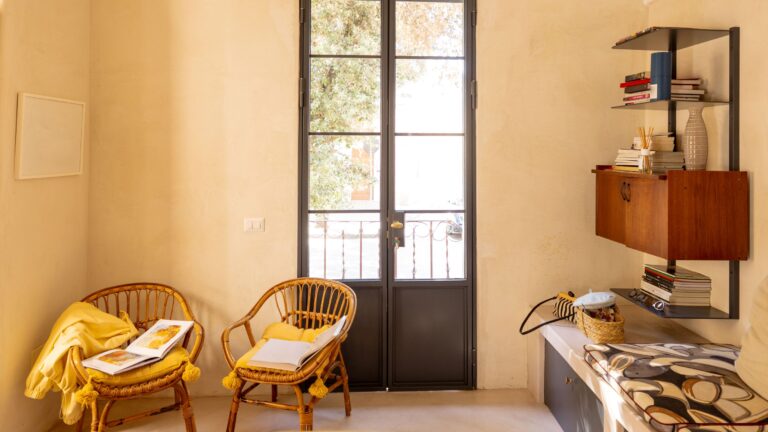
Just like lighting conditions, the combination of colours with different materials can significantly affect how we perceive a shade. A warm white will look different next to oak flooring than it will alongside grey stone or black metal details. That is why you should always choose a shade in combination with the other materials used in your interior or on your façade.
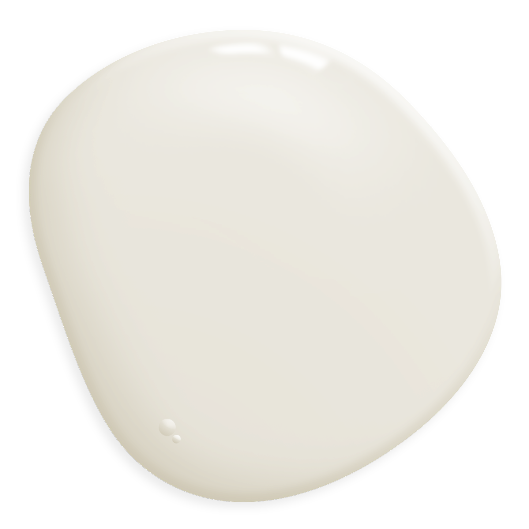
When in doubt, choose Classic White
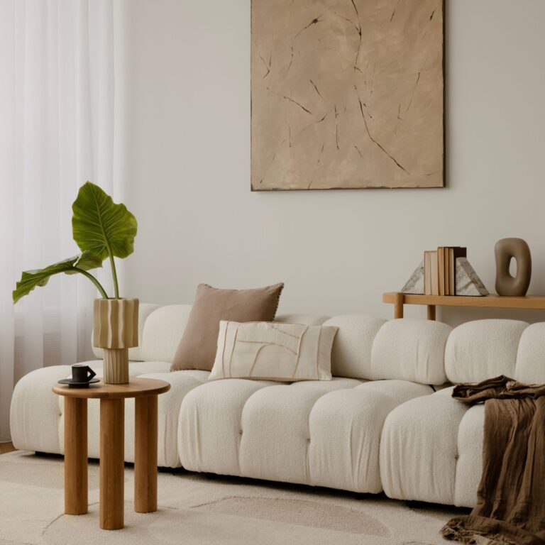
A completely white wall can sometimes look harsh, clinical and dull. Believe us, off-white shades often work much better in living spaces. All you need is a little time to find the right one.